How Arcline's DevRel Team Sketches LinkedIn Visuals in 30 Seconds
A developer infrastructure company uses sketch-to-image to turn quick wireframes into polished LinkedIn graphics — with exact layout control that text prompts can't match.
Text-to-image is fast. You type a description, get a visual, move on.
But sometimes you don’t want the AI to decide the layout. You have a specific composition in your head — the big number goes on the left, the chart sits to the right, the feature callouts line up at the bottom. Describing spatial relationships in a text prompt is awkward and imprecise. “Put the metric on the left side” means something different to every model on every run.
Sketch-to-image solves this. You draw the layout — rough, ugly, 20 seconds on a whiteboard or canvas — and the AI follows your composition while applying your brand. You get both: the exact arrangement you envisioned, and the polished output you need.
Arcline — a developer infrastructure company that provides API analytics and monitoring — uses this workflow for all their LinkedIn content. Here’s how.
Arcline’s brand system
Every image Arcline publishes follows the same visual rules. These are configured once in the brand guidelines panel and applied automatically to every generation.
Visual style: Dark, minimal, data-forward. Precise engineering aesthetic — think Linear, Vercel, Stripe. Subtle grid patterns, clean geometry, modern sans-serif typography. No playful gradients or organic shapes. Everything should feel engineered and intentional.
Color palette:
- Electric Blue
#3B82F6— primary accent, data highlights, interactive elements - Deep Space
#0A0F1E— backgrounds - Indigo
#6366F1— secondary depth, gradient accents - Slate
#94A3B8— secondary text - White
#F8FAFC— headlines, high contrast
Typography: Geometric sans-serif. Heavy weight for metrics and headlines. Regular for body. No decorative typefaces.
Tone keywords: Precise, Technical, Authoritative, Minimal, Data-forward
Avoid list: Organic shapes, playful illustrations, warm tones, rounded/bubbly elements, stock photo aesthetics
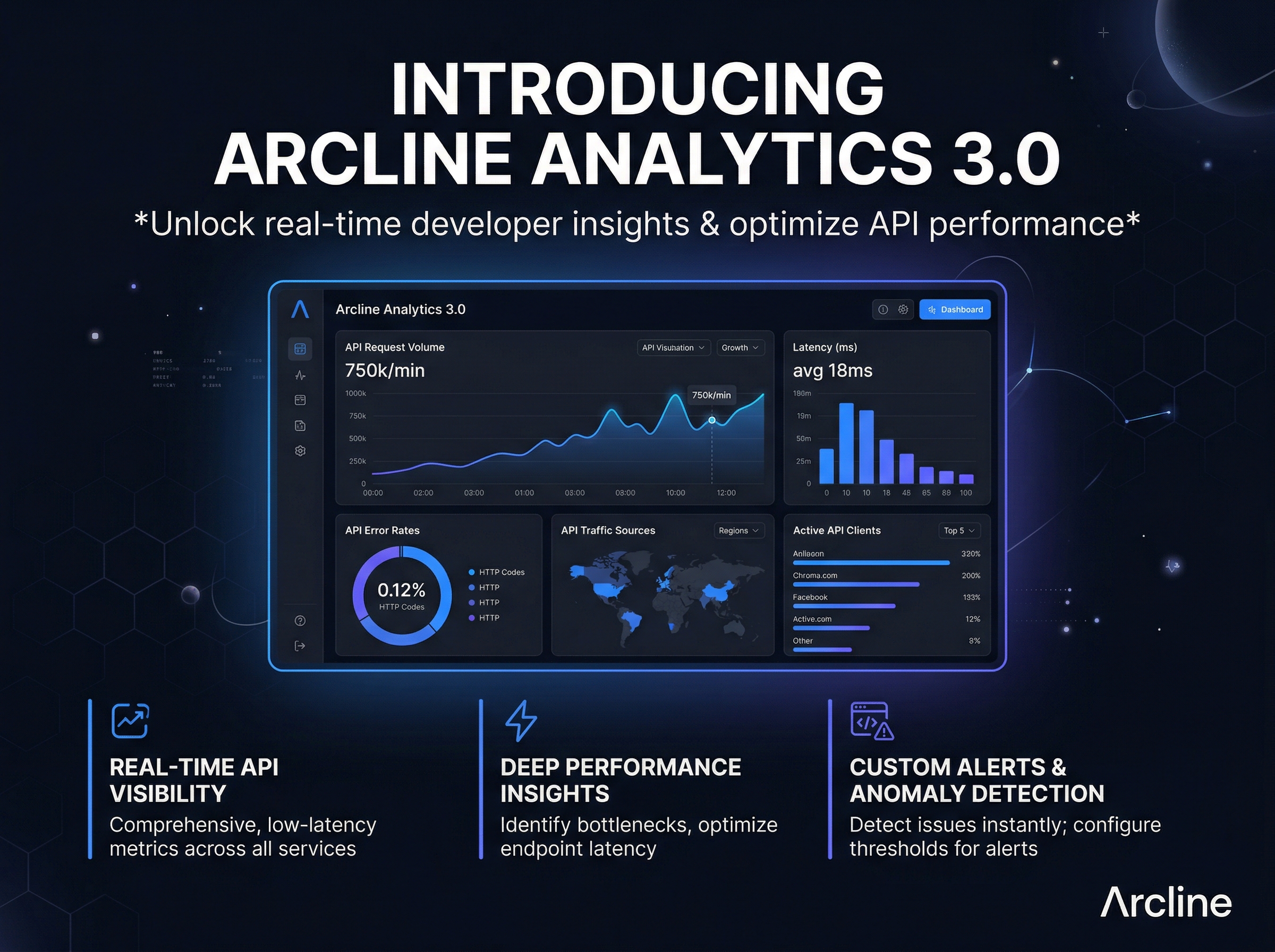
1. Product launch announcement
Marcus, Head of DevRel at Arcline, needs to announce Analytics 3.0 on LinkedIn. He has a specific layout in mind: bold headline at the top, a dashboard screenshot mockup in the center, and three feature highlights across the bottom.
He could describe this in a text prompt. But “put the dashboard in the middle with features below” rarely produces the exact proportions he wants. Instead, he opens the sketch canvas and draws it in 20 seconds.
The sketch:
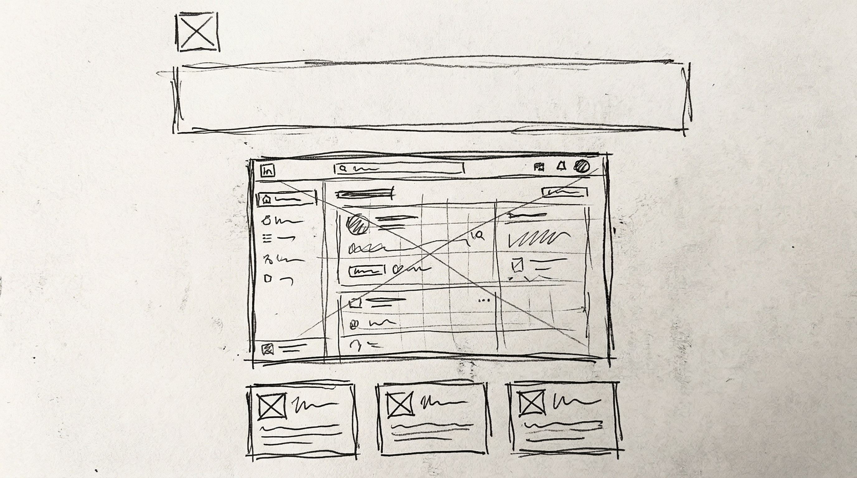
Headline area at the top. Dashboard mockup centered and taking up most of the middle. Three cards across the bottom for feature callouts. Logo placeholder in the corner. Total time: about 20 seconds with a mouse.
The result:
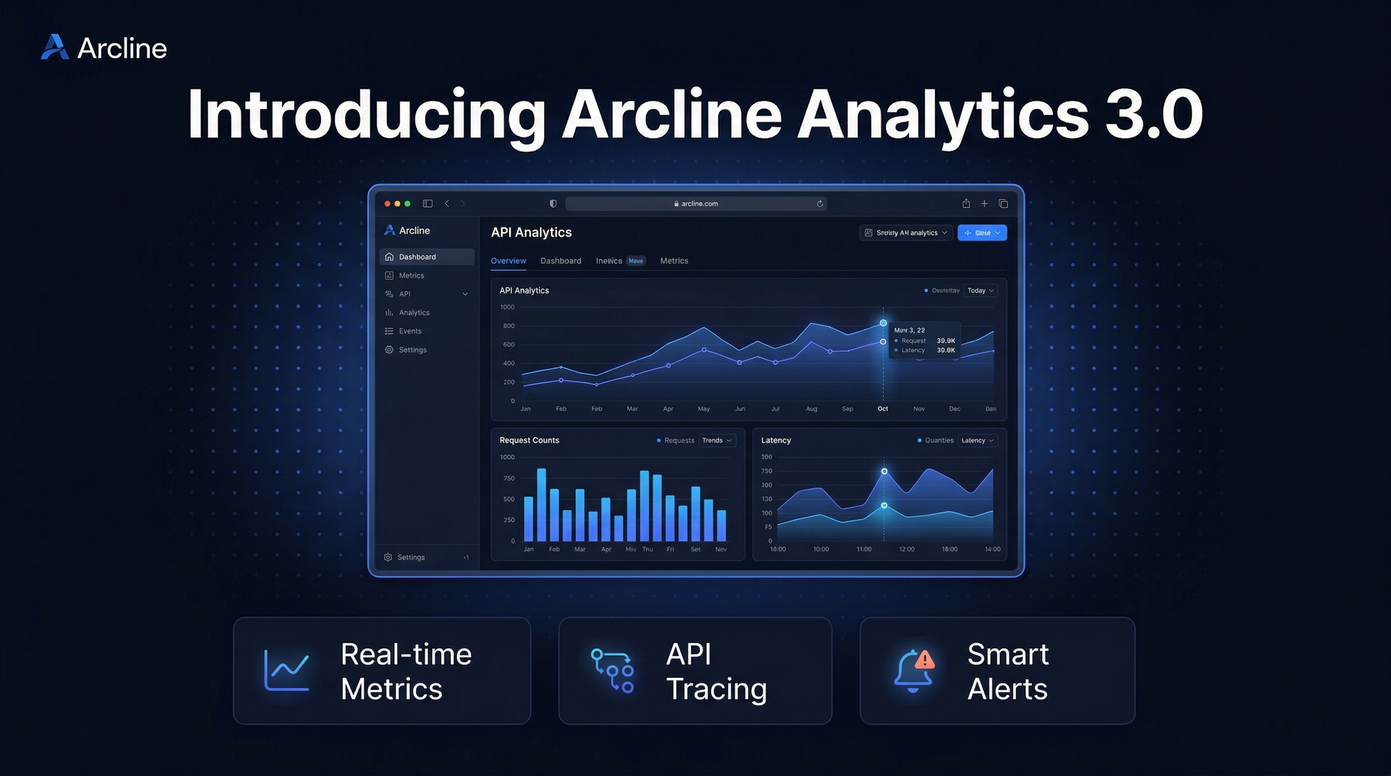
The AI followed the sketch’s composition exactly: headline at the top, dashboard centered, three feature boxes at the bottom. But it filled in the Arcline brand — deep space background, electric blue accents, geometric typography, and a realistic analytics dashboard instead of the crude rectangles. The grid pattern in the background adds subtle technical texture.
This is the visual that performs on LinkedIn: dark enough to stop the scroll on the white feed, detailed enough to show real product value, branded enough to be instantly recognizable as Arcline.
2. Engineering milestone card
Arcline just hit 10 million API requests processed daily. Marcus wants a LinkedIn card that makes the number feel massive — big bold metric dominating the left side, upward trend chart on the right, context line at the bottom.
The sketch:
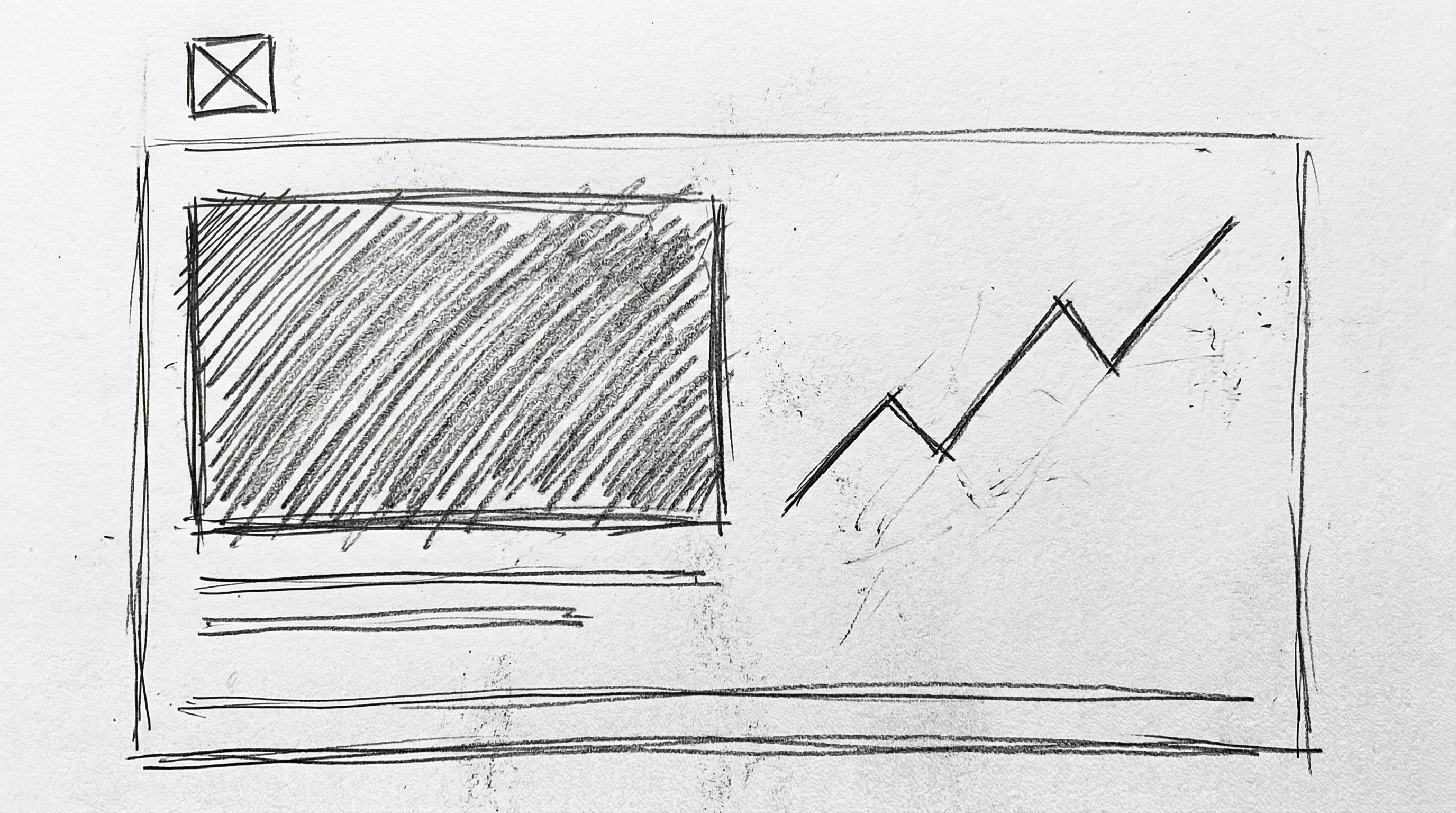
Big number area on the left. Upward-trending chart on the right. Metric label and context line below. Logo in the corner.
The result:
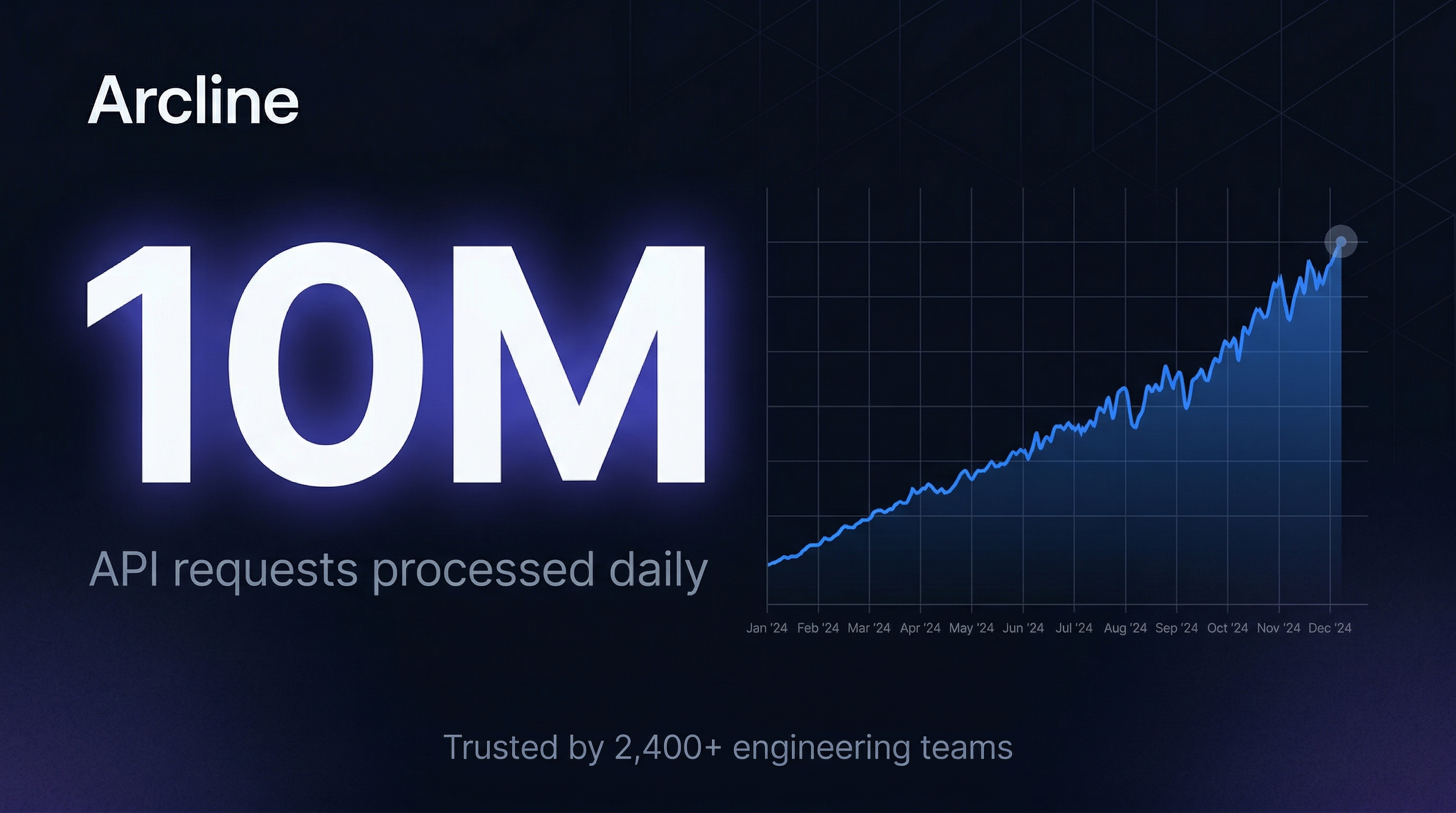
The “10M” dominates exactly as intended. The trend chart rises from left to right, reinforcing the growth story before anyone reads the context. The indigo glow behind the number creates depth without competing with the data. The grid pattern in the upper right anchors the composition.
This is the kind of content that gets engagement on developer LinkedIn — real metrics, clean design, zero fluff. Posts like this from companies like Vercel, PlanetScale, and Railway consistently outperform generic announcement text.
3. Technical architecture diagram
Marcus is writing a “How We Built It” engineering blog post. He needs a LinkedIn image that shows Arcline’s system architecture in a way that’s both technically accurate and visually branded.
The sketch:
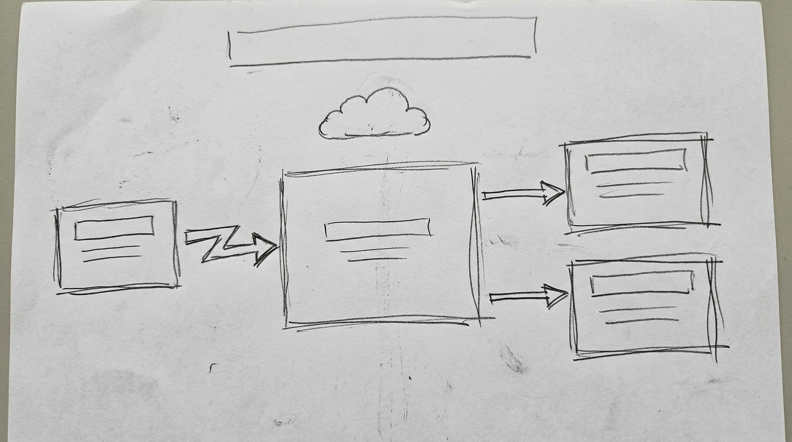
Three boxes in a flow: API Gateway on the left, Arcline Core in the center, Analytics Engine and Alert Pipeline on the right. Arrows showing data flow. Cloud icon at the top for customer APIs. Title area.
The result:
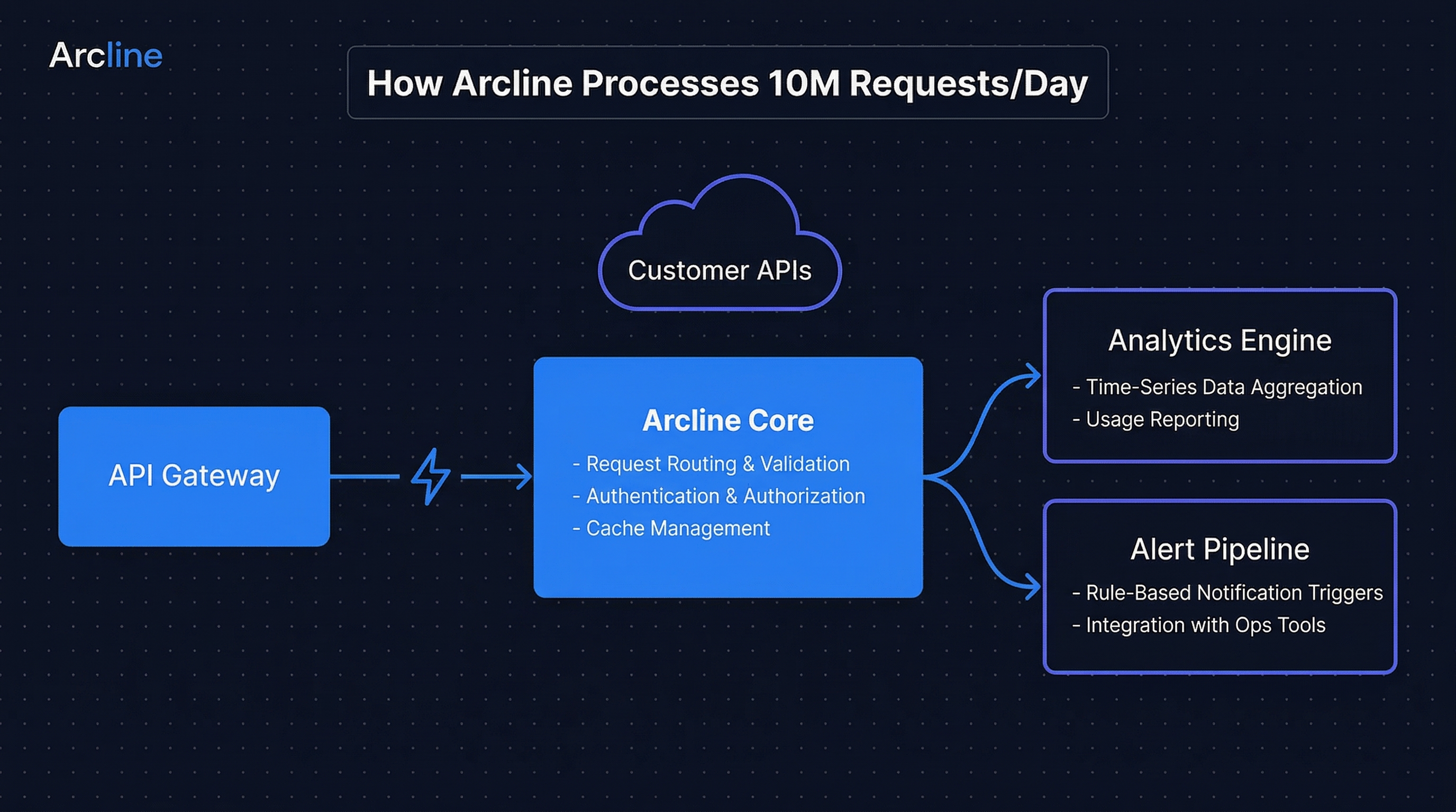
The rough boxes and arrows turned into a clean, branded technical diagram. The flow direction, component relationships, and overall layout match the sketch — but now with proper labeling, consistent styling, and the Arcline brand applied throughout.
Architecture diagrams are the highest-value content type on developer LinkedIn. They demonstrate technical depth and give readers something they can actually learn from. Most teams either draw these in Excalidraw (fast but ugly) or Figma (polished but slow). With sketch-to-image, Marcus gets Figma-quality output at Excalidraw speed.
One sketch, three platforms
The same product announcement needs to appear on LinkedIn, X/Twitter, and the company blog. Different platforms need different compositions and aspect ratios.
LinkedIn Post (4:3, landscape):
Landscape format optimized for LinkedIn’s feed layout. The dashboard has room to breathe, and the headline is large enough to read while scrolling.
X/Twitter Post (1:1, square):
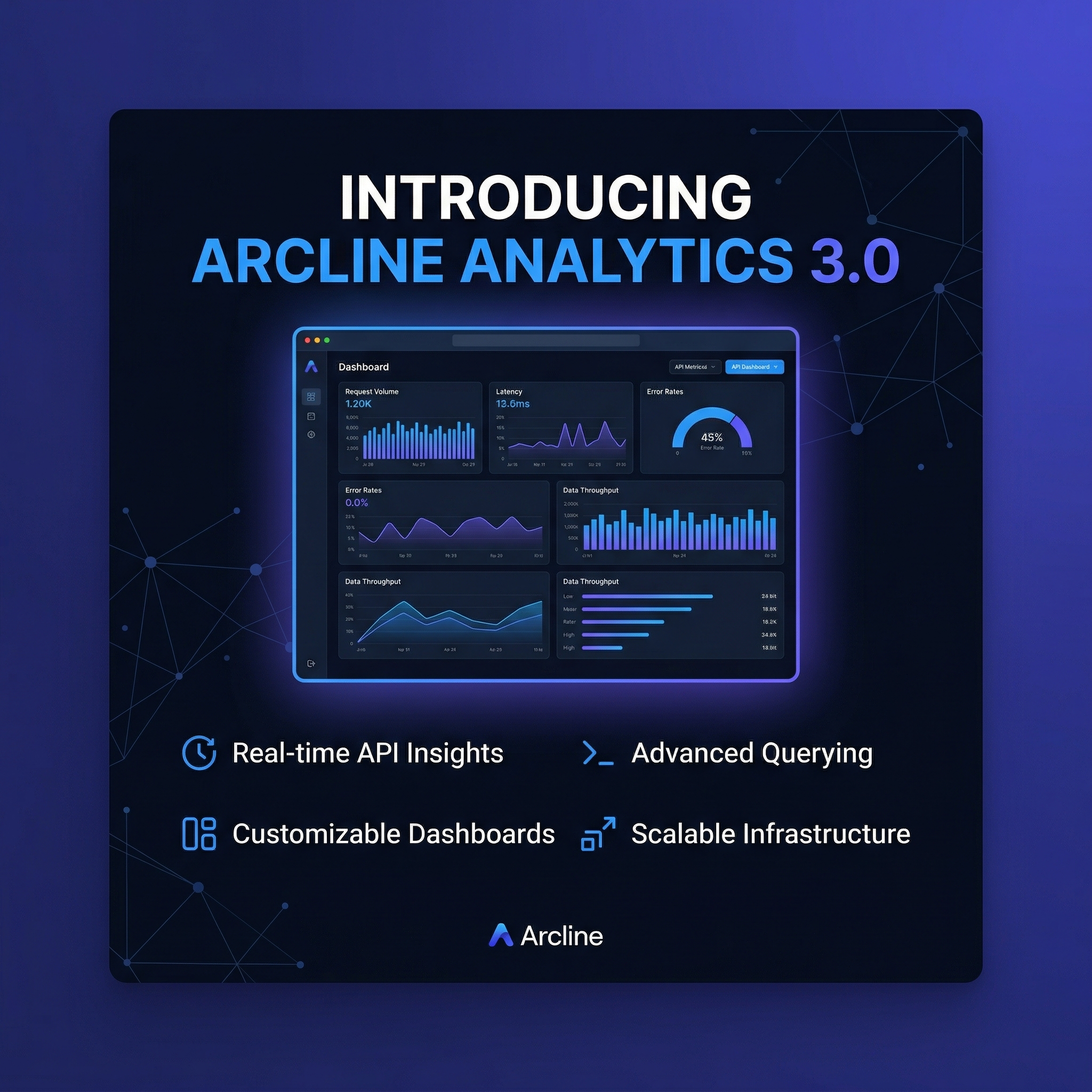
Square format for X. The composition tightens — the dashboard is more compact, the feature callouts are closer together. The same brand, the same message, optimized for a different scroll experience.
These aren’t manual crops. Each version was regenerated with the same sketch but a different aspect ratio, so the AI recomposed the elements for the target format.
Sketch vs. text: when composition matters
Not every LinkedIn visual needs sketch-to-image. For simple cards — a stat highlight, a quote, a blog promo — text-to-image with the right content type template is faster.
Sketch-to-image earns its keep when:
- You have a specific layout in your head. The big number needs to be on the left. The chart needs to be to the right. The features need to line up at the bottom.
- You’re doing something custom. Architecture diagrams, product walkthroughs, comparison layouts — formats that don’t fit a standard template.
- Spatial relationships matter. “Feature A next to Feature B, with the dashboard above” is hard to describe in text. Easy to sketch.
For Arcline, about 40% of their LinkedIn content uses sketch-to-image (announcements, architecture posts, custom milestone layouts) and 60% uses text-to-image (stat cards, quotes, blog promos via content type templates). The two modes complement each other.
A playbook for dev tools companies
If your company ships developer tools, your LinkedIn content looks like Arcline’s: product announcements, engineering milestones, architecture explainers, metric celebrations.
Start by setting up your brand — dark background, accent color, typography rules. Generate a stat card to validate the look. Then try a sketch: draw a product launch layout on the canvas, add your brand prompt, and generate. By the second sketch, you’ll feel the difference between telling the AI what you want (text) and showing it (sketch).
Set up your brand kit and try sketch-to-image — first generations are free.