How Amplify Creates 12 LinkedIn Visuals Per Week
See how a B2B social media platform produces stat cards, blog promos, and quote graphics on-brand at scale using ImageLayer.
Every B2B marketing team has the same Monday morning problem.
You need three stat cards for the engagement report going out Tuesday. A blog promo for the article publishing Wednesday. A quote graphic for the employee advocacy push on Thursday. A visual for the benchmark report launching Friday. And the product team just moved up a feature release, so add an announcement card.
That’s five distinct visuals. In Canva, each one takes 10–15 minutes — finding the template, adjusting brand colors, nudging text alignment, exporting at the right size, realizing the teal is wrong, fixing it, re-exporting. Multiply by five. You just burned an hour on production work that doesn’t move pipeline.
Amplify — a B2B social media management platform — decided to stop losing that hour. Here’s the exact content they produce with ImageLayer, and how any B2B social team can replicate the workflow.
Amplify’s brand system
Every image Amplify publishes follows the same visual rules. These rules live in a single set of brand instructions that get pasted into the Additional notes field of every content type template.
Visual style: Modern, data-forward design. Dark backgrounds for LinkedIn feed visibility — dark cards cut through LinkedIn’s white interface and stop the scroll. Mesh gradients using soft organic blobs of teal, indigo, and cyan to create atmospheric depth. Each content type gets a slightly different gradient treatment to keep the feed visually diverse while staying on-brand.
Color palette:
- Electric Cyan
#00D4FF— primary accent, data highlights, CTAs - Midnight Navy
#0B1120— backgrounds - Indigo
#4338CA— secondary depth, gradient accents - White
#F8FAFC— text, high contrast
Typography: Clean geometric sans-serif. Bold for metrics and headlines. Regular for body. No serifs, no script fonts.
The notes field is the key. Any team member pastes the same brand instructions, and every image comes out consistent — whether it’s the intern or the VP of Marketing.
1. Stat highlight cards
B2B social teams live by engagement metrics. When Amplify has a number worth sharing, they need it on LinkedIn within minutes — not after a design request.
Content Type: Stat Highlight
Fields used:
- Metric Value: “47%”
- Metric Label: “avg increase in LinkedIn engagement”
- Context: “Across 1,200+ B2B companies”
- Additional notes: “Deep midnight navy background (#0B1120) with dramatic mesh gradient — soft organic blobs of deep teal and muted indigo creating an aurora-like atmospheric effect. The number in bright electric cyan (#00D4FF) with subtle outer glow. Faint upward-trending line chart in semi-transparent white behind the number. Small ‘Amplify’ wordmark top-left. Premium SaaS aesthetic.”
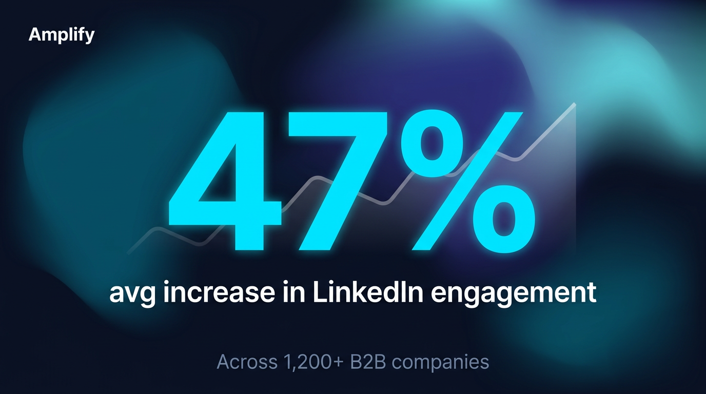
The number dominates. The mesh gradient adds depth. The trend line reinforces the upward story.
The number takes up half the image. The aurora-like gradient gives the background atmosphere without competing with the data. The faint trend line behind the number reinforces the growth message subconsciously — the viewer processes “going up” before reading a word. This is the kind of content Gong, HubSpot, and Salesforce post weekly. Amplify creates it in 30 seconds.
2. Blog article promotion
Every blog post needs a LinkedIn visual. The default link preview is ugly, unbranded, and gets buried by the algorithm. A custom image with a data hook earns the click.
Content Type: Blog / Article Promo
Fields used:
- Article Title: “Why Your Employees Are Your Best LinkedIn Channel”
- Key Takeaway: “Employee-shared content generates 8× more engagement than brand page posts”
- Additional notes: “Deep navy background with gradient arc sweeping from bottom-left in teal and cyan. Faint grid lines evoking a dashboard aesthetic. ‘BLOG’ pill tag in cyan at top. Horizontal bar chart showing Employee posts (8×, long gradient cyan bar with glow) vs Brand posts (1×, short dark bar). ‘Amplify’ wordmark bottom-left, ‘Read →’ CTA in cyan bottom-right. Data-forward editorial design.”
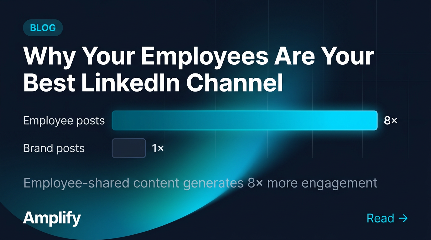
The bar chart gives readers a reason to click — the data tells the story before they read a word.
The “BLOG” pill signals content type instantly. The bar chart comparison provides value in the image itself — the reader learns something just by looking at it. That’s what earns engagement on LinkedIn: images that teach, not just images that decorate. The gradient arc and faint grid lines make the whole thing feel like a living dashboard rather than a static card.
3. Employee advocacy quotes
Employee advocacy is a core B2B social strategy. When employees share company content, it gets 8× more engagement than brand page posts. But the visuals need to look professional while feeling personal — not like a corporate marketing asset pushed through a distribution tool.
Content Type: Quote Card
Fields used:
- Quote: “We went from spending 3 hours a week on LinkedIn visuals to 15 minutes. The content actually looks better now.”
- Author: “Sarah Chen”
- Role: “Head of Marketing, DataSync”
- Additional notes: “Deep midnight navy background with soft indigo gradient glow in upper right corner and subtle geometric line pattern at low opacity. Large decorative cyan quotation marks (#00D4FF). Clean white sans-serif typography with generous spacing. Thin cyan accent line below quote. Editorial quality. Small ‘Amplify’ wordmark bottom-right.”
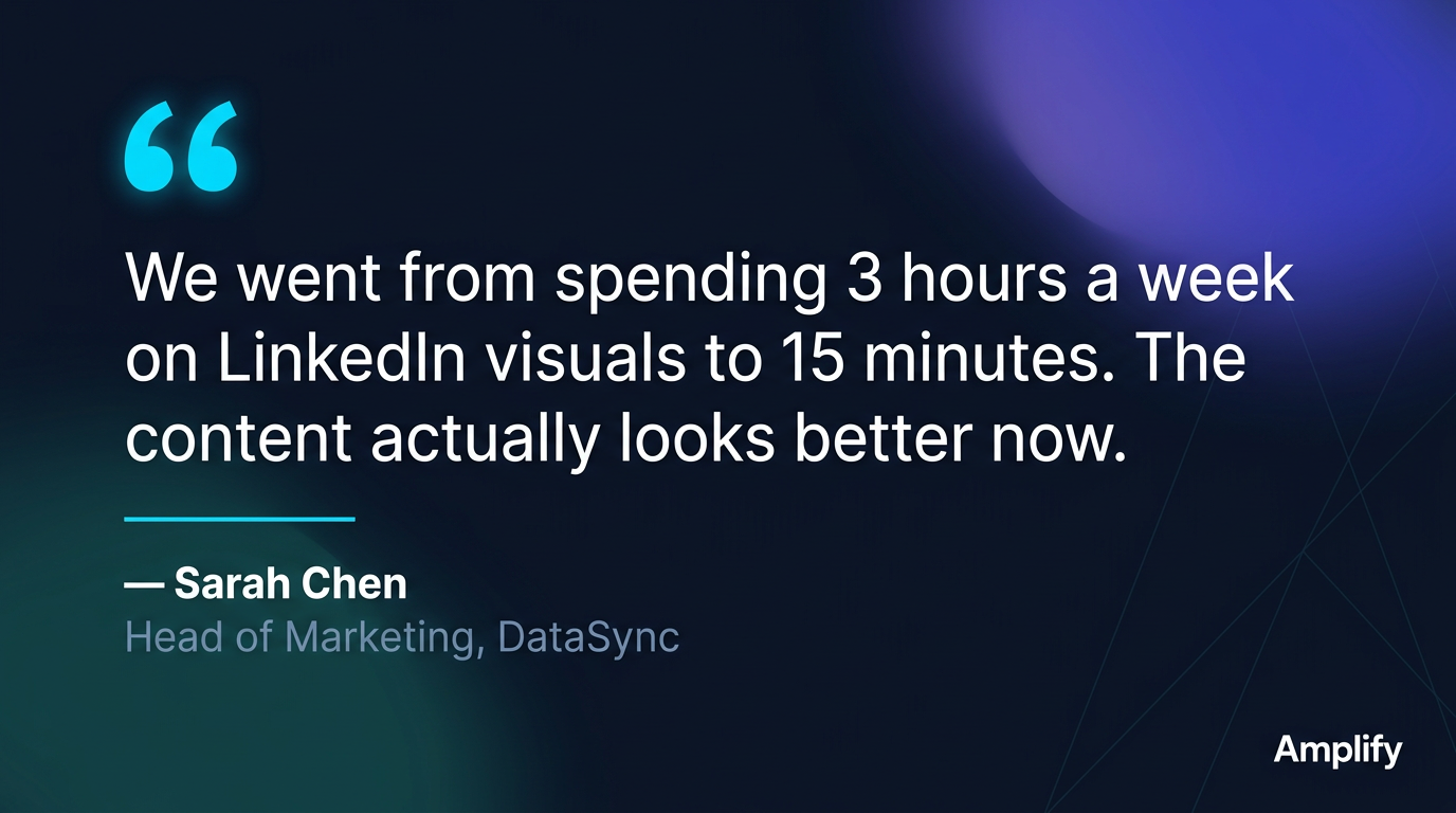
The indigo glow and geometric texture add depth. The quote text is large enough to read in-feed.
The quotation marks are the visual anchor — distinctive, branded, instantly recognizable. The indigo gradient in the corner adds warmth and prevents the card from feeling flat. The geometric line pattern adds a subtle tech-forward feel without distracting from the words. The text is sized for in-feed reading: you don’t need to click to get the message. This is the format HubSpot, Gong, and Drift use for customer testimonials — a proven pattern, with Amplify’s identity applied in seconds.
4. Report and whitepaper promotion
B2B companies publish benchmark reports, whitepapers, and industry research. Each needs a LinkedIn visual that signals “this is substantial research worth downloading.” That signal comes from a report cover mockup — it tells the viewer “this is a real publication, not another blog post.”
Content Type: General (freeform prompt)
Prompt used:
LinkedIn visual promoting the ‘2026 B2B Social Media Benchmark Report’ by Amplify. Deep midnight navy background with radial indigo gradient glow behind a white report cover mockup shown at a slight 3D perspective angle. Faint geometric circuit-like lines in background. Left side: bold white headline ‘2026 B2B Social Media Benchmark Report’ with subtitle ‘Key findings from 1,200+ B2B companies’ in muted gray and cyan accent line. Right side: report cover with data visualizations in teal and cyan — bar charts, donut chart, trend lines — and small Amplify logo. Premium, authoritative research publication aesthetic.
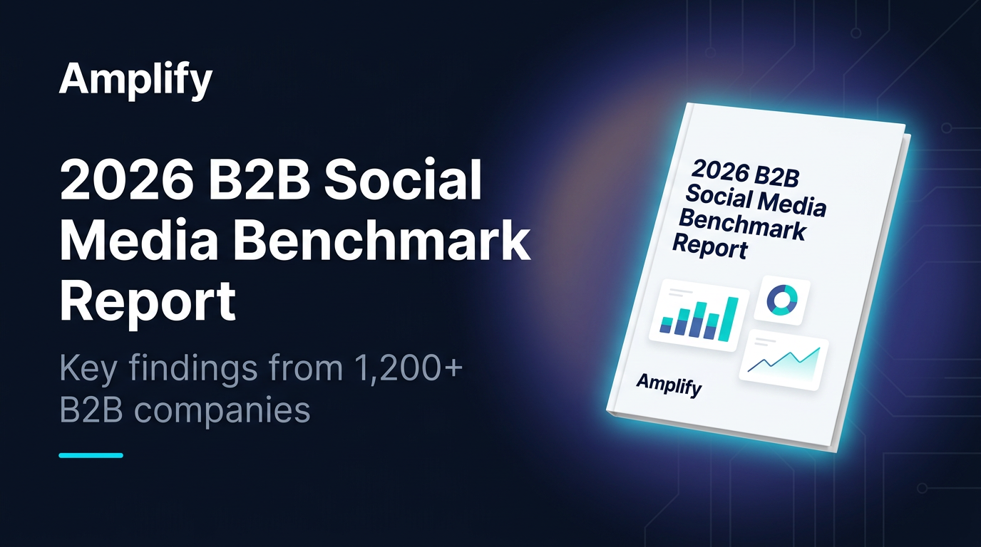
The 3D cover mockup creates legitimacy. The cyan glow makes it feel premium.
The perspective-angled cover is a deliberate choice: it creates physical presence, making the report feel tangible in a digital feed. The cyan glow radiating from behind the mockup draws the eye to it like a product hero shot. The data visualizations on the cover use Amplify’s exact brand colors — teal bars, cyan trend lines — reinforcing the data-forward identity. Any B2B team that publishes gated content creates this type of visual multiple times per quarter.
5. Product launch announcement
When Amplify ships a major update, the LinkedIn post needs to match the energy of the release. Not a text update. Not a screenshot. A designed announcement that feels like an event.
Content Type: Announcement
Fields used:
- Headline: “Introducing Analytics 2.0”
- Key Details: “Real-time Dashboards. Cross-platform Attribution. Team Leaderboards.”
- Additional notes: “Deep navy background with dramatic multi-color mesh gradient — organic blobs of electric cyan, rich indigo, and warm amber creating an aurora effect. Subtle geometric accent shapes (triangles, hexagons) in white at low opacity. Thin cyan line separating headline from features. Three feature highlights in horizontal row with small icons. Premium SaaS launch aesthetic.”
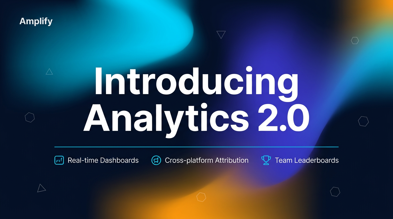
The three-color gradient creates launch energy. The geometric shapes add technical sophistication.
This is the most visually dynamic card in the set — and intentionally so. The warm amber blob breaks the cyan-and-navy palette for the first time, signaling “this is different, this is new.” The geometric shapes (triangles, hexagons) scattered at low opacity add a subtle layer of technical sophistication. The three feature callouts give readers enough information to understand the release without clicking. This is the visual language you see from Linear, Vercel, and Stripe for product announcements — except it took 60 seconds, not a design sprint.
What this looks like in practice
Here’s Amplify’s typical weekly LinkedIn content calendar:
| Content type | Weekly volume | Time per asset |
|---|---|---|
| Stat highlights | 3 | ~30 seconds |
| Blog promos | 3 | ~45 seconds |
| Employee advocacy quotes | 2 | ~30 seconds |
| Report / whitepaper promos | 1 | ~60 seconds |
| Announcements | 1 | ~60 seconds |
Total: 10 LinkedIn visuals per week. Total production time: under 7 minutes.
In Canva, that’s 10 images × 12 minutes = 2 hours per week. And with three people on the team, consistency is the first casualty — everyone picks slightly different cyans, slightly different spacing, slightly different gradient angles.
The notes field eliminates the consistency problem entirely. One set of brand instructions. Paste it. Every image follows the same system regardless of who creates it.
A playbook you can copy
This is the pattern. If your company publishes on LinkedIn, you produce these exact content types — stat cards, blog promos, advocacy quotes, report visuals, launch announcements. The only variable is whether you spend hours per week in Canva or minutes with branded templates.
Start with your brand rules: background color, primary accent, gradient style, typography, what to avoid. Paste those rules into the Additional notes field. Generate one stat card. Then a blog promo. Then a quote graphic. By the third image, you’ll see how fast the workflow is — and how consistent the results stay across your team.
Set up your brand kit and generate your first LinkedIn visual — it takes about five minutes.